The complete system
Made to move from court to club.
The same focused visual language moves from product packaging into apparel and community.

A specialist product repositioned, redesigned and later evolved into a more accessible hydration brand.
A product system designed for the moments around sport.

February to August 2025.
Positioning, identity, packaging, product architecture, communication and transition strategy.
The previous ONTOEZ logo was supplied by the client.
Origin & Order developed the new ONTOEZ identity, complete shelf system and the later HUDDLEZ brand.
ONTOEZ had been framed mainly around recovery. We widened the story to everyday hydration without losing the product's functional credibility.
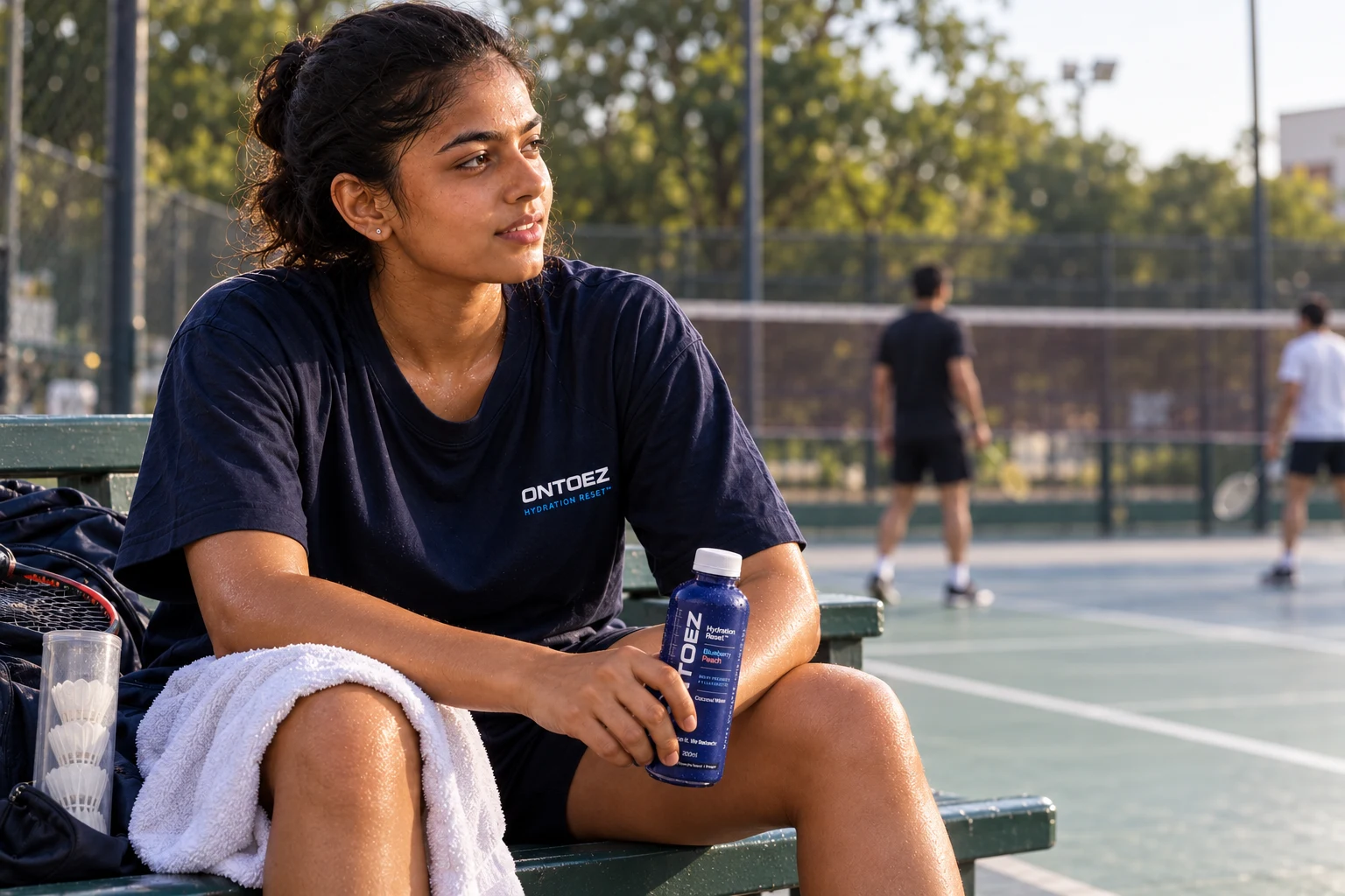
A stronger vertical wordmark, disciplined information hierarchy and flavour-led colour system made the small bottle easier to recognise in a busy category.
One master system gave four flavours a clear family resemblance.
Original identity supplied by the client. New identity created by Origin & Order.


As the market widened, the specialist tone of ONTOEZ became restrictive. The next step was not a visual refresh. It was a new name and more social personality.
HUDDLEZ retained the hydration category while shifting the emotional centre toward people, energy and everyday participation.
The product learning stayed. The brand world changed.

Bolder, more social and built for campaign energy.


Two campaign directions
Origin & Order led the ONTOEZ repositioning, new identity, packaging direction, product architecture and communication. We then named HUDDLEZ and built its creative direction from the commercial learning.