LegacyThe school families already knew

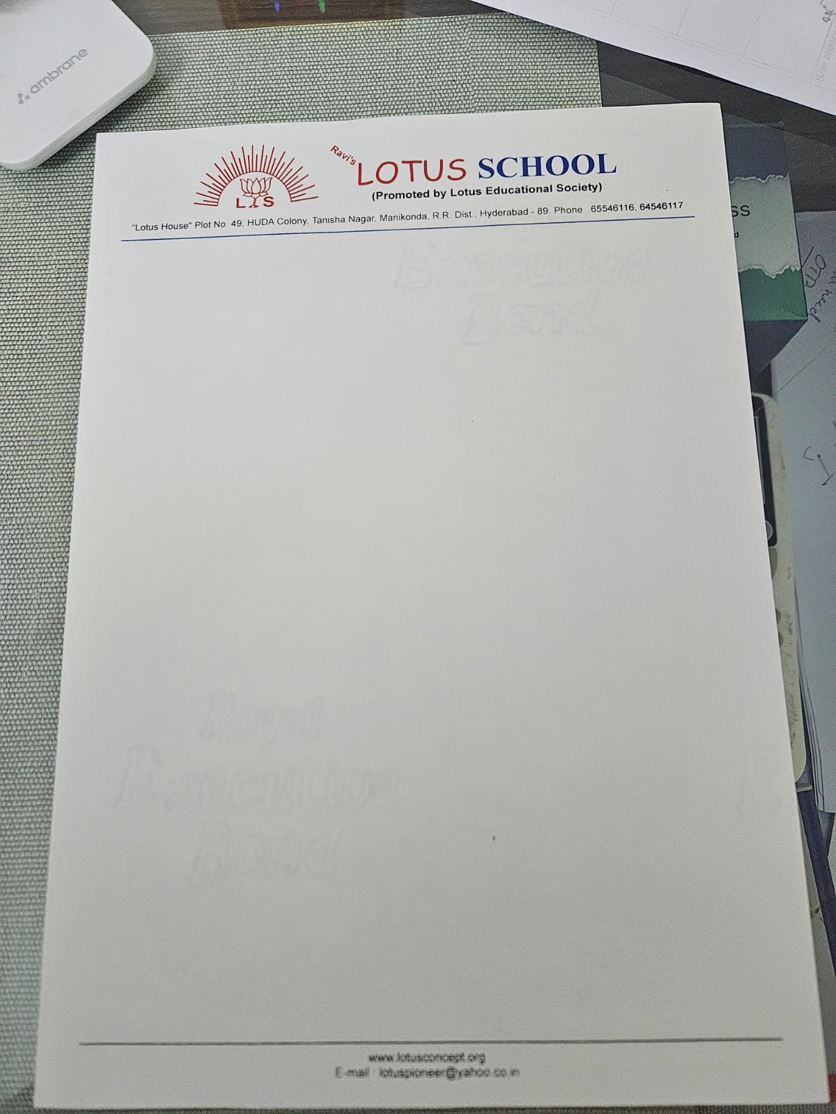

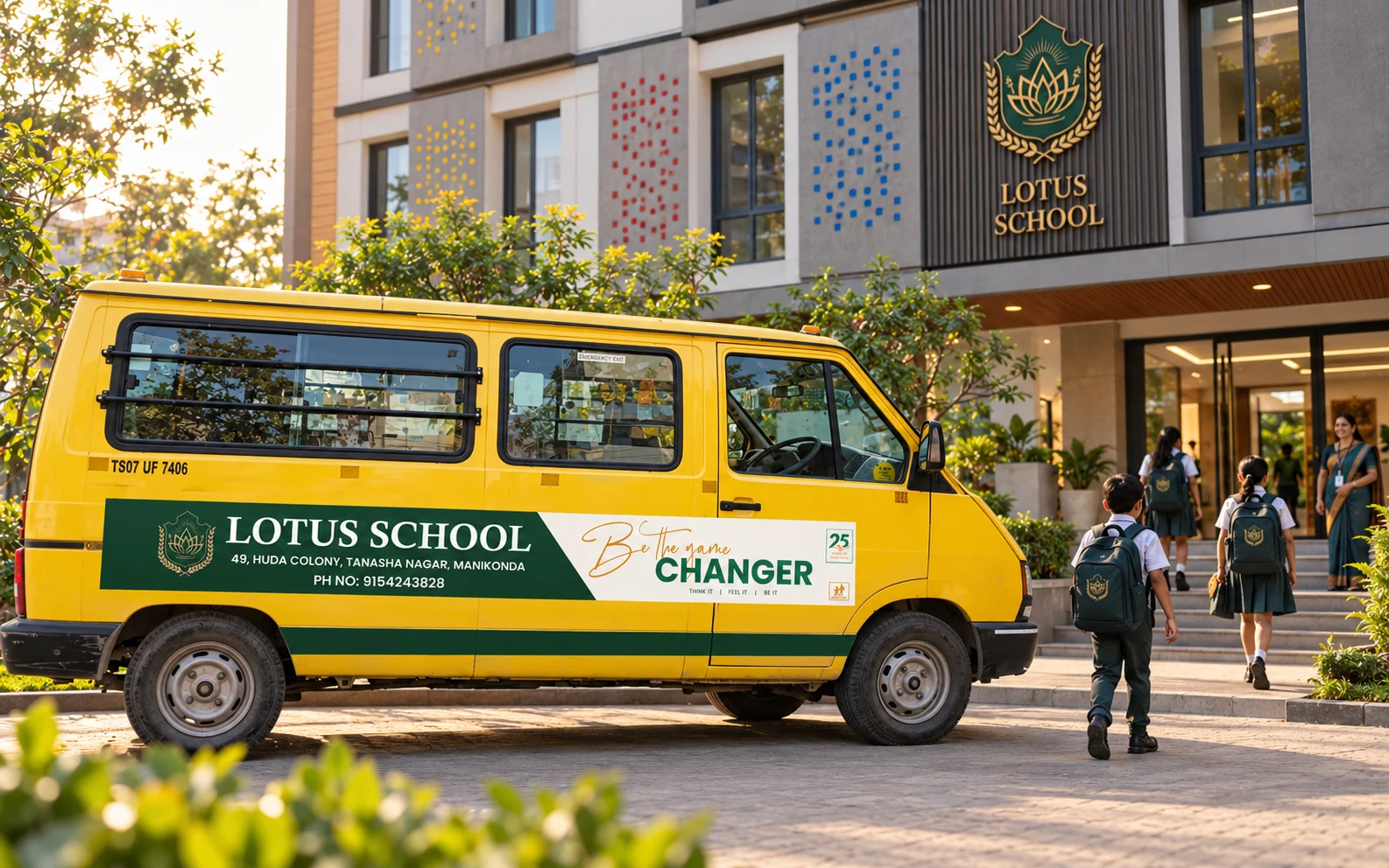
A complete 2024 transformation across the logo, campus, admissions, transport, student materials and public storytelling.
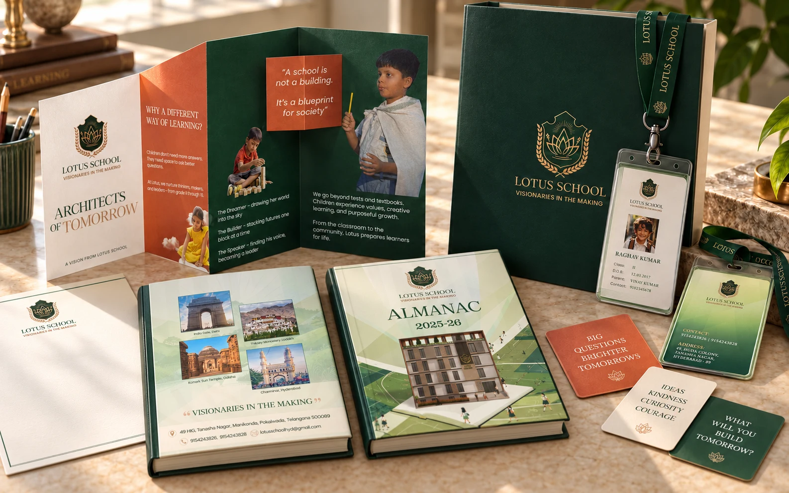
The crest, almanac, admissions and student materials now speak as one institution.
1999.
2024.
Positioning, logo, identity, admissions, stationery, campus, transport, film and campaign direction.
A premium state-board school preparing children for life, not only examinations.
Since 1999, Lotus School has earned credibility through its relationship with students, parents and the wider community. The 2024 transformation brought that legacy into a more confident, contemporary identity.
The new system had to feel premium and future-facing while keeping the warmth and familiarity people already trusted.
One shared identity now connects the institution, its people and its place in the city.
A familiar school presence, evolved for its next chapter.

The lotus, laurel, torch and shield form a layered emblem of growth, achievement and learning. Deep green, warm paper and gold create an established character without generic academic formality.
“Visionaries in the making” reframed the school around possibility beyond the syllabus. The system then moved across the materials parents, students and the city actually encounter.
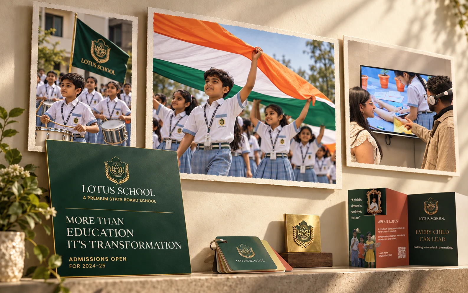

A clear invitation for families to see what Lotus School stands for.

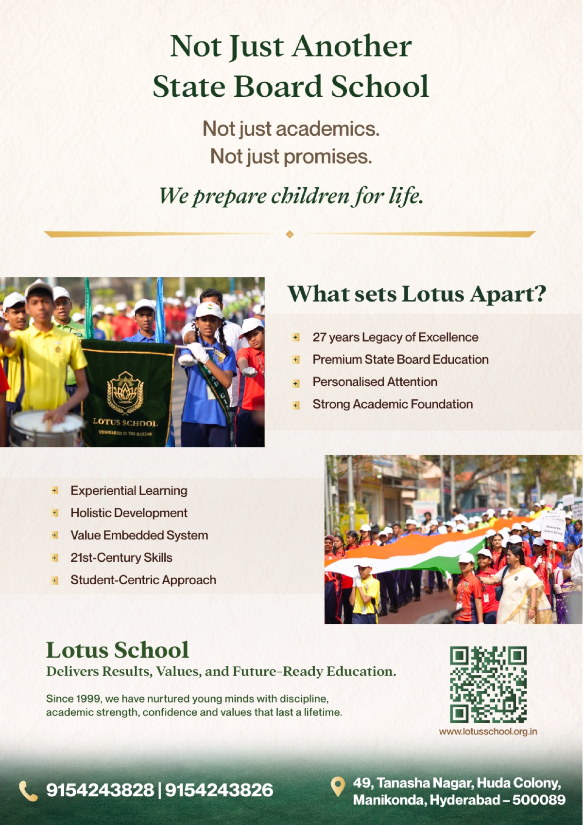
Confident minds. Courageous leaders. Communication that carries the school’s values into every parent conversation.
Origin & Order also shaped film, event and public-campaign communication. The work showed the school not only as an academic institution, but as an active participant in the life of its students and city.
Rather than embedding a silent video, the work is presented as a set of clearly described campaign stories.
Stories designed, shot and edited to make the school’s values visible.

A film-led expression of the school’s belief in students as builders of the future. The story extends the identity into emotion, aspiration and school life.
 My City, My ResponsibilityA 26 January rally across Manikonda with a 25-metre Indian flag, promoting civic responsibility and a cleaner city.
 Messages the city could not ignoreStudent-held signs addressed traffic safety, cleanliness and respectful public behaviour throughout the rally.
 LexiconAn edited teaser for a day celebrating the English language.
Origin & Order led the positioning, logo, visual identity and communication direction, then extended the system across admissions, student materials, transport, campus visibility, film and public campaigns.